Uncertainty
Throughout this lesson, you’ll use the built-in mpg dataset to make histograms, density plots, box plots, violin plots, and other graphics that show uncertainty.
Sorry if mpg is getting repetitive! For short interactive things like this, it’s easier to use built-in and easy-to-load datasets like mpg and gapminder instead of loading CSV files, hence our constant reuse of the dataset. This is fairly normal too—the majority of examples in R help pages (and in peoples’ blog posts) use things like mpg orgapminder, or even iris, which measures the lengths and widths of a bunch of iris flowers in the 1930s (fun fact! I don’t like using iris because the data was originally used in an article in the Annals of Eugenics (😬) in 1936, and the data was collected to advance eugenics, and there’s no good reason to use data like that in 2020.)
So we work with cars instead of racist flower data.
The mpg dataset is available in R as soon as you load ggplot2 (or tidyverse). Yu don’t have to run read_csv() or anything—it’s just there in the background already.
As a reminder, here are the first few rows of the mpg dataset:
head(mpg)## # A tibble: 6 x 11
## manufacturer model displ year cyl trans drv cty hwy fl class
## <chr> <chr> <dbl> <int> <int> <chr> <chr> <int> <int> <chr> <chr>
## 1 audi a4 1.8 1999 4 auto(l5) f 18 29 p compa…
## 2 audi a4 1.8 1999 4 manual(m5) f 21 29 p compa…
## 3 audi a4 2 2008 4 manual(m6) f 20 31 p compa…
## 4 audi a4 2 2008 4 auto(av) f 21 30 p compa…
## 5 audi a4 2.8 1999 6 auto(l5) f 16 26 p compa…
## 6 audi a4 2.8 1999 6 manual(m5) f 18 26 p compa…Histograms
When working with histograms, you always need to think about the bin width. Histograms calculate the counts of rows within specific ranges of data, and the shape of the histogram will change depending on how wide or narrow these ranges (or bins, or buckets) are.
Your turn: Change this code to add a specific bin width for city miles per gallon cty (hint: binwidth). Play around with different widths until you find one that represents the data well.
By default, histograms are filled with a dark grey color and the bars have no borders. Additionally, R places the center of the bars at specific numbers: if you have a bin width of 5, for instance, a bar will show the range from 7.5 to 12.5 instead of 5-10 or 10-15.
Your turn: Do the following:
- Add a specific bin width
- Add a white border (hint:
color) - Fill with #E16462
- Make it so the bars start at whole numbers like 10 or 20 (hint:
boundary)
You can add extra aesthetics to encode additional information about the distribution of variables across categories.
Your turn: Make a histogram of cty and fill by drv (drive: front, rear, and 4-wheel). Make sure you specify a good bin width.
That’s too much information! Instead of only filling, you can separate the data into multiple plots.
Your turn: Make a histogram of cty fill and facet by drv. Make sure you specify a good bin width. Make sure you specify a good bin width.
Density plots
When working with density plots in this class you don’t need to worry too much about the calculus behind the scenes that creates the curves. But you can change those settings if you really want.
Your turn: Do the following:
- Fill this density plot with #E16462
- Add a border (hint:
color) using #9C3836, with size = 1 - Change the bandwidth (hint:
bw) to 0.5, then 1, then 10
Like histograms, you can map other variables onto the plot. It’s often a good idea to make the curves semi-transparent so you can see the different distributions.
Your turn: Do the following:
- Fill this plot using the
drvvariable - Make the density plots 50% transparent
Even with transparency, it’s often difficult to interpret density plots like this. As an alternative, you can use the ggridges package to make ridge plots. Look at the documentation and examples for ggridges for lots of details about different plots you can make.
Your turn: Convert this plot into a ridge plot.
Boxes, violins, and dots
Finally, you can use things like boxplots and violin plots to show the distribution of variables, either by themselves or across categories.
Box plots show the distribution of a variable by highlighting specific details, like the 25th, 50th (median) and 75th percentile, as well as the assumed minimum, assumed maximum, and outliers:
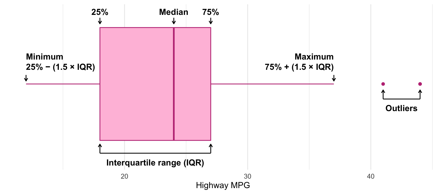
Anatomy of a boxplot
When making boxplots with ggplot, you need to map the variable of interest to the x aesthetic (or y if you want a vertical boxplot), and you can optionally map a second categorical variable to the y aesthetic (or x if you want a vertical boxplot).
You can adjust the fill and color of the plot, and you can change what counts as outliers with the coef argument. By default outliers are any point that is beyond the 75th percentile + 1.5 × the interquartile range (or below the 25th percentile + 1.5 × IQR), but that’s adjustable.
Your turn: Do the following:
- Fill the boxplot with #E6AD3C
- Color the boxplot with #5ABD51
- Change the definition of outliers to be 5 times the IQR
You can also use violin plots instead of boxplot, which show the mirrored density distribution. When doing this, it’s often helpful to add other geoms like jittered points to show more of the data
Your turn: Do the following
- Change this boxplot to use violins instead
- Add jittered points with a jittering width of 0.1 and sized at 0.5