Graphic design
Lesson for Tuesday, May 12, 2020
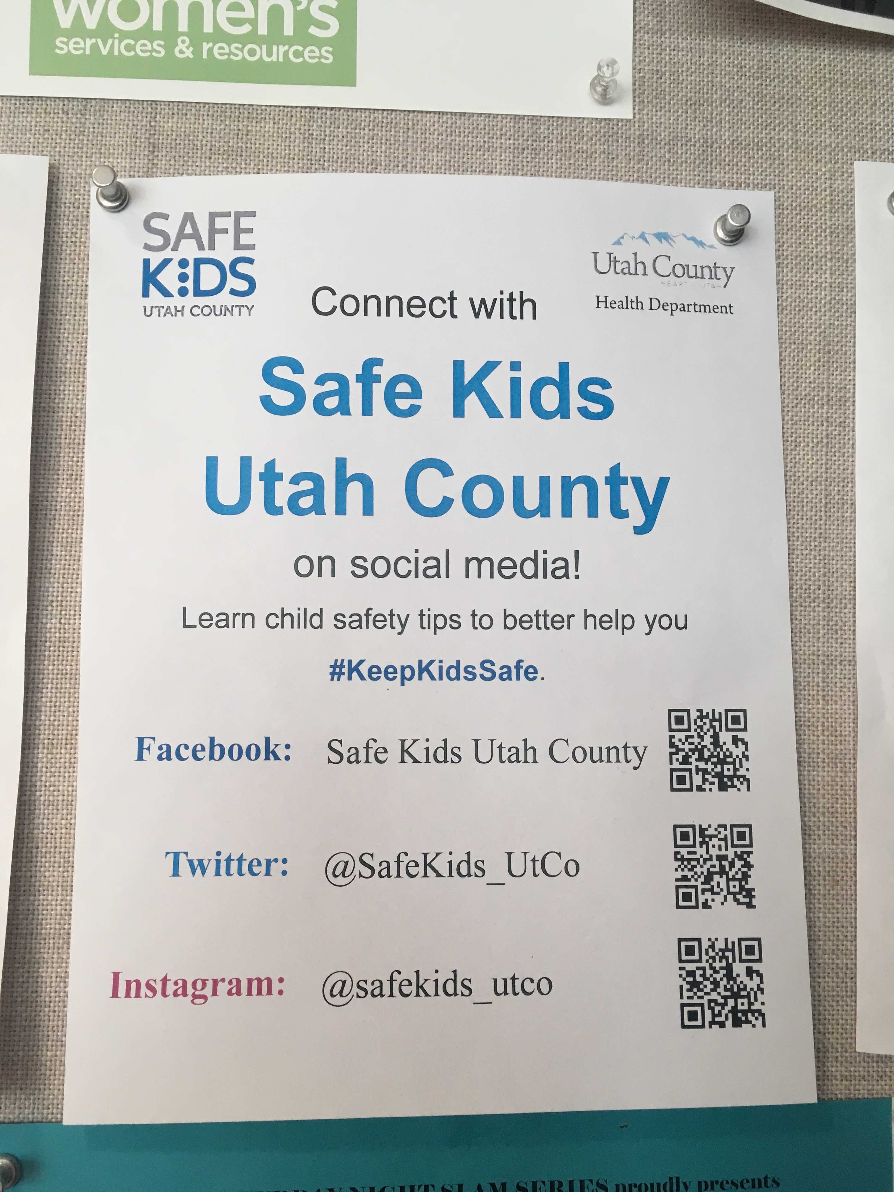
For this example, I’m going to critique and improve this random flyer I found posted in the BYU library in September 2018:

It’s not the best designed poster, but it’s incredibly typical of what you see in the real world. By applying the principles of CRAP, we can improve the poster significantly.
If you download and unzip this file, you can follow along too (but you don’t have to—you can just sit back and enjoy the ride).
Critique
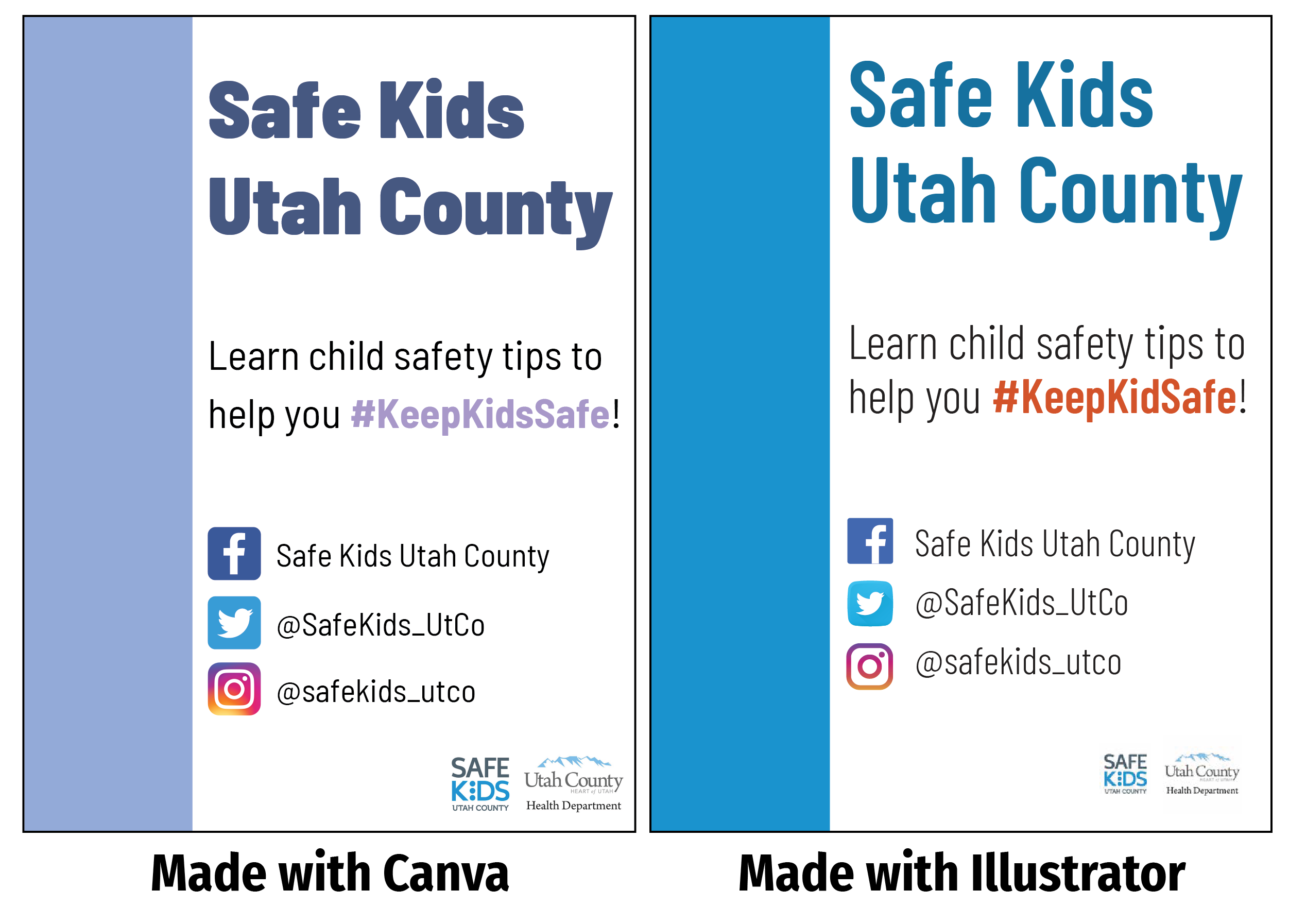
Redesign in Canva
Redesign in Illustrator
Final versions
