Amounts and proportions
For this example, we’re going to use real world data to demonstrate some different ways to visualize amounts and proportions. We’ll use data from the CDC and the Social Security Administration about the number of daily births in the United States from 1994–2014. FiveThirtyEight reported a story using this data in 2016 and they posted relatively CSV files on GitHub, so we can download and use those.
If you want to follow along with this example, you can download the data directly from GitHub or by using these links (you’ll likely need to right click on these and choose “Save Link As…”):
Live coding example
Complete code
(This is a slightly cleaned up version of the code from the video.)
Load data
There are two CSV files:
US_births_1994-2003_CDC_NCHS.csvcontains U.S. births data for the years 1994 to 2003, as provided by the Centers for Disease Control and Prevention’s National Center for Health Statistics.US_births_2000-2014_SSA.csvcontains U.S. births data for the years 2000 to 2014, as provided by the Social Security Administration.
Since the two datasets overlap in 2000–2003, we use Social Security Administration data for those years.
We downloaded the data from GitHub and placed the CSV files in a folder named data. We’ll then load them with read_csv() and combine them into one data frame.
library(tidyverse)
library(scales)   # For nice labels in charts

births_1994_1999 <- read_csv("data/US_births_1994-2003_CDC_NCHS.csv") %>%
  # Ignore anything after 2000
  filter(year < 2000)

births_2000_2014 <- read_csv("data/US_births_2000-2014_SSA.csv")

births_combined <- bind_rows(births_1994_1999, births_2000_2014)
Wrangle data
Let’s look at the first few rows of the data to see what we’re working with:
head(births_combined)## # A tibble: 6 x 5
## year month date_of_month day_of_week births
## <dbl> <dbl> <dbl> <dbl> <dbl>
## 1 1994 1 1 6 8096
## 2 1994 1 2 7 7772
## 3 1994 1 3 1 10142
## 4 1994 1 4 2 11248
## 5 1994 1 5 3 11053
## 6 1994 1 6 4 11406The columns for year and births seem straightforward and ready to use. The columns for month and day of the week could be improved if we changed them to text (i.e. January instead of 1; Tuesday instead of 3). To fix this, we can convert these columns to categorical variables, or factors in R. We can also specify that these categories (or factors) are ordered, meaning that Feburary comes after January, etc. Without ordering, R will plot them alphabetically, which isn’t very helpful.
We’ll make a new dataset named births that’s based on the combined births data, but with some new columns added:
# The c() function lets us make a list of values
month_names <- c("January", "February", "March", "April", "May", "June", "July",
                 "August", "September", "October", "November", "December")

day_names <- c("Monday", "Tuesday", "Wednesday",
               "Thursday", "Friday", "Saturday", "Sunday")

births <- births_combined %>%
  # Make month an ordered factor, using the month_name list as labels
  mutate(month = factor(month, labels = month_names, ordered = TRUE)) %>%
  mutate(day_of_week = factor(day_of_week, labels = day_names, ordered = TRUE),
         date_of_month_categorical = factor(date_of_month)) %>%
  # Add a column indicating if the day is on a weekend
  mutate(weekend = ifelse(day_of_week %in% c("Saturday", "Sunday"), TRUE, FALSE))

head(births)
## # A tibble: 6 x 7
## year month date_of_month day_of_week births date_of_month_categori… weekend
## <dbl> <ord> <dbl> <ord> <dbl> <fct> <lgl>
## 1 1994 January 1 Saturday 8096 1 TRUE
## 2 1994 January 2 Sunday 7772 2 TRUE
## 3 1994 January 3 Monday 10142 3 FALSE
## 4 1994 January 4 Tuesday 11248 4 FALSE
## 5 1994 January 5 Wednesday 11053 5 FALSE
## 6 1994 January 6 Thursday 11406 6 FALSEIf you look at the data now, you can see the columns are changed and have different types. year and date_of_month are still numbers, but month, and day_of_week are ordered factors (ord) and date_of_month_categorical is a regular factor (fct). Technically it’s also ordered, but because it’s already alphabetical (i.e. 2 naturally comes after 1), we don’t need to force it to be in the right order.
Our births data is now clean and ready to go!
Bar plot
First we can look at a bar chart showing the total number of births each day. We need to make a smaller summarized dataset and then we’ll plot it:
total_births_weekday <- births %>%
  group_by(day_of_week) %>%
  summarize(total = sum(births))

ggplot(data = total_births_weekday,
       mapping = aes(x = day_of_week, y = total, fill = day_of_week)) +
  geom_col() +
  # Turn off the fill legend because it's redundant
  guides(fill = FALSE)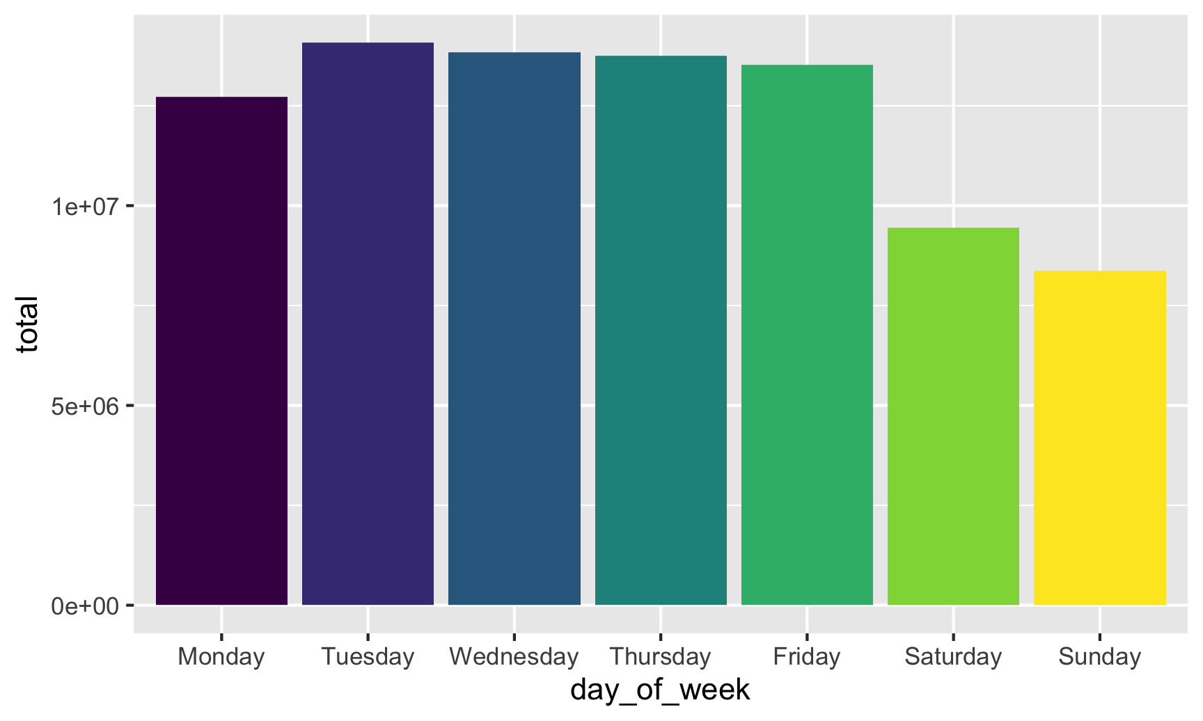
If we fill by day of the week, we get 7 different colors, which is fine (I guess), but doesn’t really help tell a story. The main story here is that there are far fewer births during weekends. If we create a new column that flags if a row is Saturday or Sunday, we can fill by that column instead:
total_births_weekday <- births %>%
  group_by(day_of_week) %>%
  summarize(total = sum(births)) %>%
  mutate(weekend = ifelse(day_of_week %in% c("Saturday", "Sunday"), TRUE, FALSE))

ggplot(data = total_births_weekday,
       mapping = aes(x = day_of_week, y = total, fill = weekend)) +
  geom_col()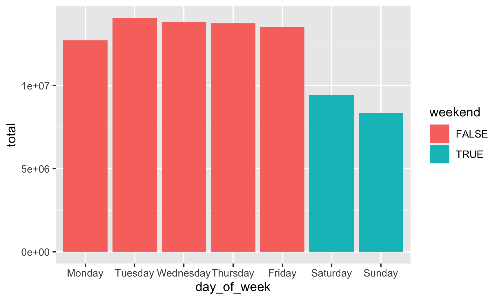
Neat! Those default colors are kinda ugly, though, so let’s use the principles of preattentive processing and contrast to highlight the weekend bars:
ggplot(data = total_births_weekday,
       mapping = aes(x = day_of_week, y = total, fill = weekend)) +
  geom_col() +
  # Use grey and orange
  scale_fill_manual(values = c("grey70", "#f2ad22")) +
  # Use commas instead of scientific notation
  scale_y_continuous(labels = comma) +
  # Turn off the legend since the title shows what the orange is
  guides(fill = FALSE) +
  labs(title = "Weekends are unpopular times for giving birth",
       x = NULL, y = "Total births")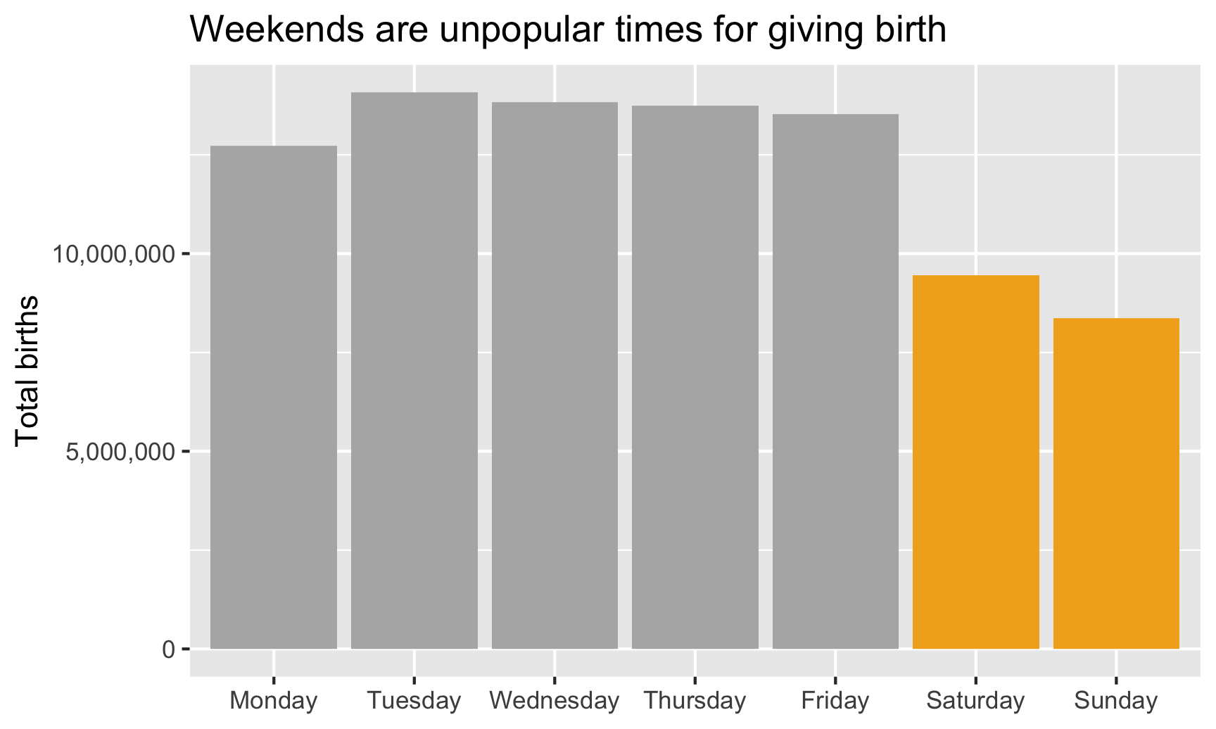
Lollipop chart
Since the ends of the bars are often the most important part of the graph, we can use a lollipop chart to emphasize them. We’ll keep all the same code from our bar chart and make a few changes:
- Color by weekend instead of fill by weekend, since points and lines are colored in ggplot, not filled
- Switch
scale_fill_manual()toscale_color_manual()and turn off thecolorlegend in theguides()layer - Switch
geom_col()togeom_pointrange(). Thegeom_pointrange()layer requires two additional aesthetics:yminandymaxfor the ends of the lines that come out of the point. Here we’ll setyminto 0 so it starts at the x-axis, and we’ll setymaxtototalso it ends at the point.
ggplot(data = total_births_weekday,
       mapping = aes(x = day_of_week, y = total, color = weekend)) +
  geom_pointrange(aes(ymin = 0, ymax = total),
                  # Make the lines a little thicker and the dots a little bigger
                  fatten = 5, size = 1.5) +
  # Use grey and orange
  scale_color_manual(values = c("grey70", "#f2ad22")) +
  # Use commas instead of scientific notation
  scale_y_continuous(labels = comma) +
  # Turn off the legend since the title shows what the orange is
  guides(color = FALSE) +
  labs(title = "Weekends are unpopular times for giving birth",
       x = NULL, y = "Total births")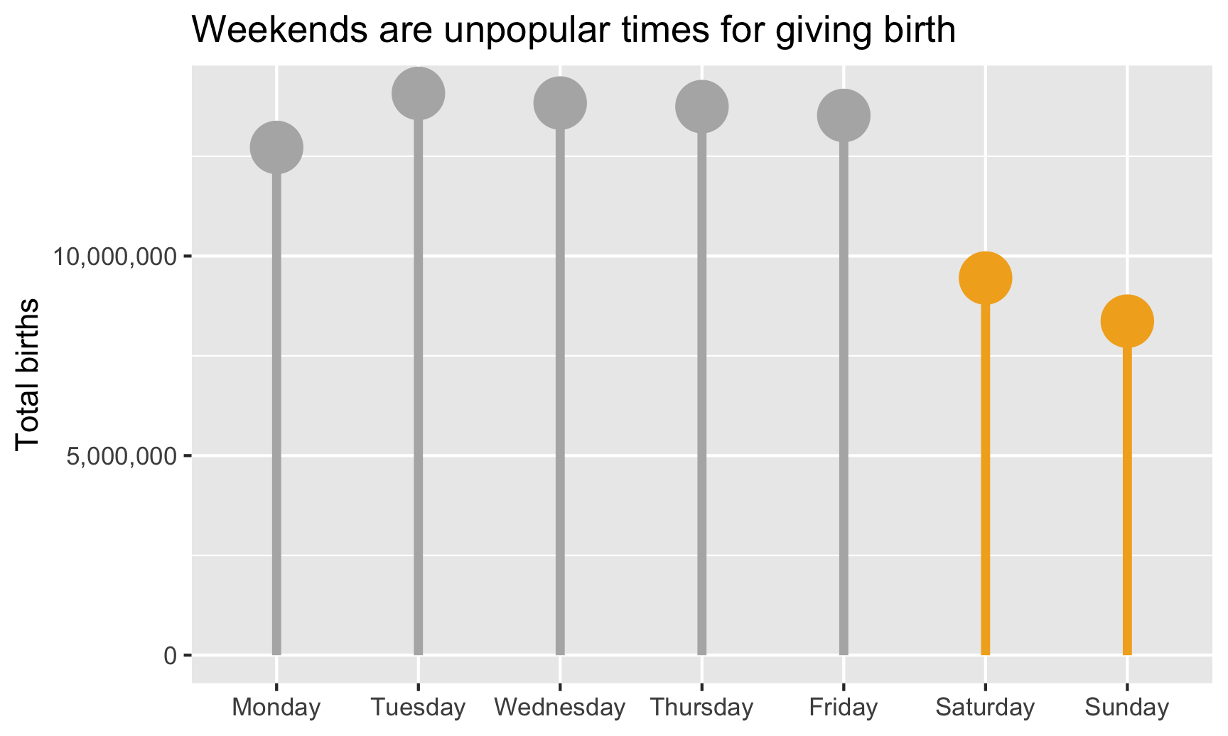
Strip plot
However, we want to #barbarplots! (Though they’re arguably okay here, since they show totals and not averages). Let’s show all the data with points. We’ll use the full dataset now, map x to weekday, y to births, and change geom_col() to geom_point(). We’ll tell geom_point() to jitter the points randomly.
ggplot(data = births,
       mapping = aes(x = day_of_week, y = births, color = weekend)) +
  scale_color_manual(values = c("grey70", "#f2ad22")) +
  geom_point(size = 0.5, position = position_jitter(height = 0)) +
  guides(color = FALSE)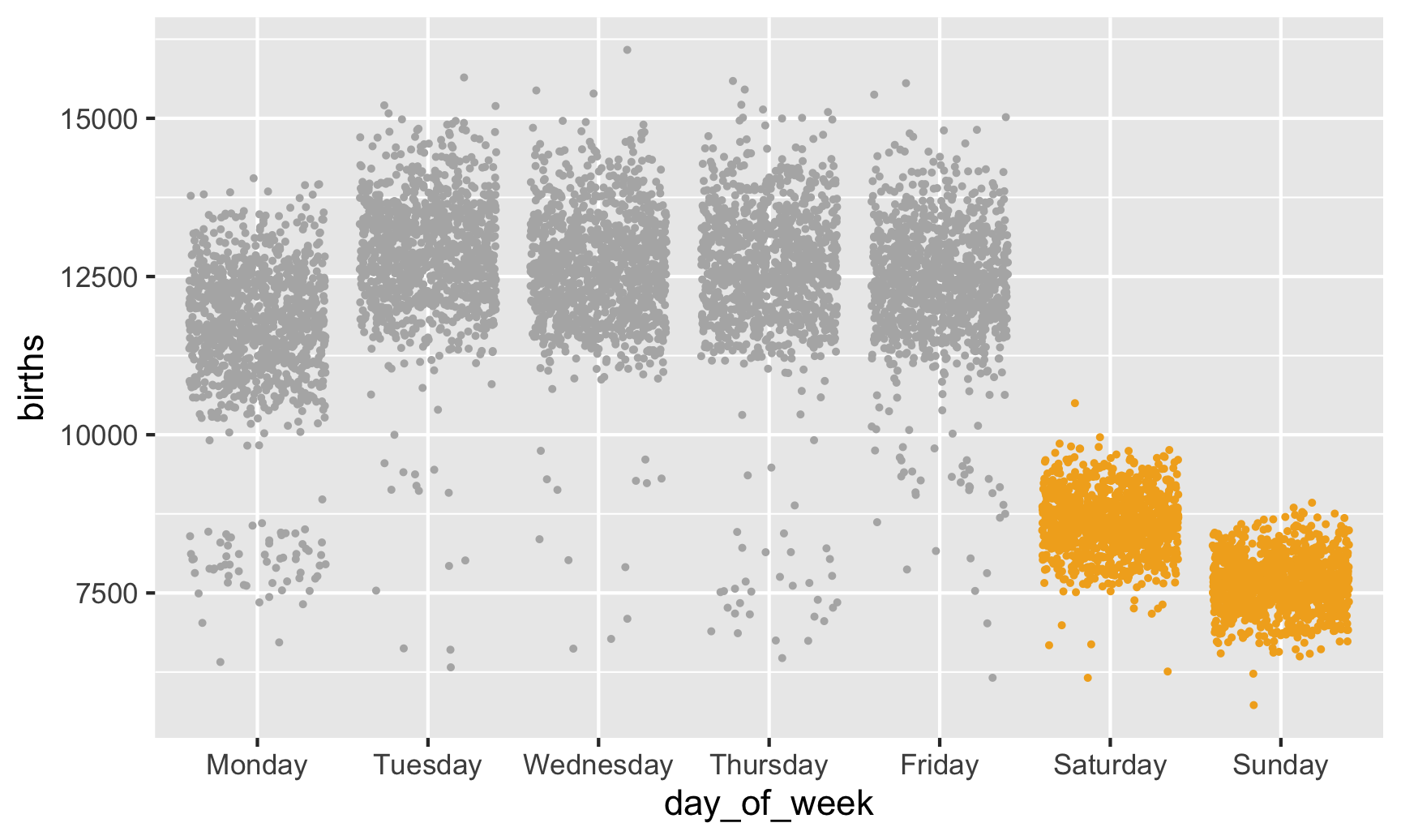
There are some interesting points in the low ends, likely because of holidays like Labor Day and Memorial Day (for the Mondays) and Thanksgiving (for the Thursday). If we had a column that indicated whether a day was a holiday, we could color by that and it would probably explain most of those low numbers. Unfortunately we don’t have that column, and it’d be hard to make. Some holidays are constant (Halloween is always October 31), but some aren’t (Thanksgiving is the fourth Thursday in November, so we’d need to find out which November 20-somethingth each year is the fourth Thursday, and good luck doing that at scale).
Beeswarm plot
We can add some structure to these points if we use the ggbeeswarm package, with either geom_beeswarm() or geom_quasirandom(). geom_quasirandom() actually works better here since there are so many points—geom_beeswarm() makes the clusters of points way too wide.
library(ggbeeswarm)

ggplot(data = births,
       mapping = aes(x = day_of_week, y = births, color = weekend)) +
  scale_color_manual(values = c("grey70", "#f2ad22")) +
  # Make these points suuuper tiny
  geom_quasirandom(size = 0.0001) +
  guides(color = FALSE)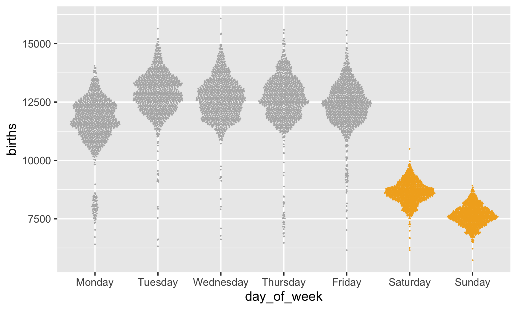
Heatmap
Finally, let’s use something non-traditional to show the average births by day in a somewhat proportional way. We can calculate the average number of births every day and then make a heatmap that fills each square by that average, thus showing the relative differences in births per day.
To do this, we need to make a summarized data frame with group_by() %>% summarize() to calculate the average number of births by month and day of the month (i.e. average for January 1, January 2, etc.).
We’ll then make a sort of calendar with date of the month on the x axis, month on the y axis, with heat map squares filled by the daily average. We’ll use geom_tile() to add squares for each day, and then add some extra scale, coordinates, and theme layers to clean up the plot:
avg_births_month_day <- births %>%
  group_by(month, date_of_month_categorical) %>%
  summarize(avg_births = mean(births))

ggplot(data = avg_births_month_day,
       # By default, the y-axis will have December at the top, so use fct_rev() to reverse it
       mapping = aes(x = date_of_month_categorical, y = fct_rev(month), fill = avg_births)) +
  geom_tile() +
  # Add viridis colors
  scale_fill_viridis_c(option = "inferno", labels = comma) +
  # Add nice labels
  labs(x = "Day of the month", y = NULL,
       title = "Average births per day",
       subtitle = "1994-2014",
       fill = "Average births") +
  # Force all the tiles to have equal widths and heights
  coord_equal() +
  # Use a cleaner theme
  theme_minimal()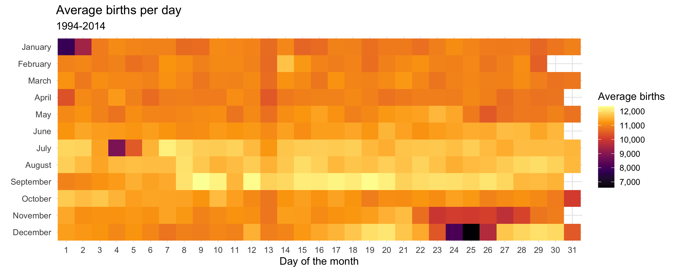
Neat! There are some really interesting trends here. Most obvious, probably, is that very few people are born on New Year’s Day, July 4th, Halloween, Thanksgiving, and Christmas.
avg_births_month_day %>%
  arrange(avg_births)
## # A tibble: 366 x 3
## # Groups: month [12]
## month date_of_month_categorical avg_births
## <ord> <fct> <dbl>
## 1 December 25 6601.
## 2 January 1 7827.
## 3 December 24 8103.
## 4 July 4 8825.
## 5 January 2 9356.
## 6 December 26 9599.
## 7 November 27 9770.
## 8 November 23 9919.
## 9 November 25 10001
## 10 October 31 10030.
## # … with 356 more rowsThe days with the highest average are in mid-September (lol my birthday is #2), likely because that’s about 9 months after the first week of January. July 7th at #7 is odd and I have no idea why it might be so popular 🤷.
avg_births_month_day %>%
  arrange(desc(avg_births))
## # A tibble: 366 x 3
## # Groups: month [12]
## month date_of_month_categorical avg_births
## <ord> <fct> <dbl>
## 1 September 9 12344.
## 2 September 19 12285.
## 3 September 12 12282.
## 4 September 17 12201.
## 5 September 10 12190.
## 6 September 20 12162.
## 7 July 7 12147.
## 8 September 15 12126.
## 9 September 16 12114.
## 10 September 18 12112.
## # … with 356 more rowsThe funniest trend is the very visible dark column for the 13th of every month. People really don’t want to give birth on the 13th.