Annotations
For this example, we’re again going to use cross-national data from the World Bank’s Open Data portal. We’ll download the data with the WDI package.
If you want to skip the data downloading, you can download the data below (you’ll likely need to right click and choose “Save Link As…”):
Live coding example
Complete code
(This is a slightly cleaned up version of the code from the video.)
Load data
First, we load the libraries we’ll be using:
library(tidyverse)  # For ggplot, dplyr, and friends
library(WDI)        # Get data from the World Bank
library(ggrepel)    # For non-overlapping labels

# You need to install ggtext from GitHub. Follow the instructions at
# https://github.com/wilkelab/ggtext
library(ggtext)     # For fancier text handling
indicators <- c("SP.POP.TOTL", # Population
"EN.ATM.CO2E.PC", # CO2 emissions
"NY.GDP.PCAP.KD") # GDP per capita
wdi_co2_raw <- WDI(country = "all", indicators, extra = TRUE,
start = 1995, end = 2015)Then we clean the data by removing non-country countries and renaming some of the columns.
wdi_clean <- wdi_co2_raw %>%
  filter(region != "Aggregates") %>%
  select(iso2c, iso3c, country, year,
         population = SP.POP.TOTL,
         co2_emissions = EN.ATM.CO2E.PC,
         gdp_per_cap = NY.GDP.PCAP.KD,
         region, income)
Clean and reshape data
Next we’ll do some substantial filtering and reshaping so that we can end up with the rankings of CO2 emissions in 1995 and 2014. I annotate as much as possible below so you can see what’s happening in each step.
co2_rankings <- wdi_clean %>%
  # Get rid of smaller countries
  filter(population > 200000) %>%
  # Only look at two years
  filter(year %in% c(1995, 2014)) %>%
  # Get rid of all the rows that have missing values in co2_emissions
  drop_na(co2_emissions) %>%
  # Look at each year individually and rank countries based on their emissions that year
  group_by(year) %>%
  mutate(ranking = rank(co2_emissions)) %>%
  ungroup() %>%
  # Only select a handful of columns, mostly just the newly created "ranking"
  # column and some country identifiers
  select(iso3c, country, year, region, income, ranking) %>%
  # Right now the data is tidy and long, but we want to widen it and create
  # separate columns for emissions in 1995 and in 2014. pivot_wider() will make
  # new columns based on the existing "year" column (that's what `names_from`
  # does), and it will add "rank_" as the prefix, so that the new columns will
  # be "rank_1995" and "rank_2014". The values that go in those new columns will
  # come from the existing "ranking" column
  pivot_wider(names_from = year, names_prefix = "rank_", values_from = ranking) %>%
  # Find the difference in ranking between 2014 and 1995
  mutate(rank_diff = rank_2014 - rank_1995) %>%
  # Remove all rows where there's a missing value in the rank_diff column
  drop_na(rank_diff) %>%
  # Make an indicator variable that is true of the absolute value of the
  # difference in rankings is greater than 25. 25 is arbitrary here—that just
  # felt like a big change in rankings
  mutate(big_change = ifelse(abs(rank_diff) >= 25, TRUE, FALSE)) %>%
  # Make another indicator variable that indicates if the rank improved by a
  # lot, worsened by a lot, or didn't change much. We use the case_when()
  # function, which is like a fancy version of ifelse() that takes multiple
  # conditions. This is how it generally works:
  #
  # case_when(
  #  some_test ~ value_if_true,
  #  some_other_test ~ value_if_true,
  #  TRUE ~ value_otherwise
  #)
  mutate(better_big_change = case_when(
    rank_diff <= -25 ~ "Rank improved",
    rank_diff >= 25 ~ "Rank worsened",
    TRUE ~ "Rank changed a little"
  ))
Here’s what that reshaped data looked like before:
head(wdi_clean)## # A tibble: 6 x 9
## iso2c iso3c country year population co2_emissions gdp_per_cap region income
## <chr> <chr> <chr> <dbl> <dbl> <dbl> <dbl> <chr> <chr>
## 1 AD AND Andorra 2015 78011 NA 41768. Europe & Central Asia High income
## 2 AD AND Andorra 2004 76244 7.36 47033. Europe & Central Asia High income
## 3 AD AND Andorra 2001 67341 7.79 41421. Europe & Central Asia High income
## 4 AD AND Andorra 2002 70049 7.59 42396. Europe & Central Asia High income
## 5 AD AND Andorra 2014 79213 5.83 40790. Europe & Central Asia High income
## 6 AD AND Andorra 1995 63850 6.66 32918. Europe & Central Asia High incomeAnd here’s what it looks like now:
head(co2_rankings)## # A tibble: 6 x 9
## iso3c country region income rank_1995 rank_2014 rank_diff big_change better_big_change
## <chr> <chr> <chr> <chr> <dbl> <dbl> <dbl> <lgl> <chr>
## 1 ARE United Arab Emirates Middle East & North Africa High income 167 171 4 FALSE Rank changed a little
## 2 AFG Afghanistan South Asia Low income 8 24 16 FALSE Rank changed a little
## 3 ALB Albania Europe & Central Asia Upper middle income 54 78 24 FALSE Rank changed a little
## 4 ARM Armenia Europe & Central Asia Upper middle income 71 76 5 FALSE Rank changed a little
## 5 AGO Angola Sub-Saharan Africa Lower middle income 59 61 2 FALSE Rank changed a little
## 6 ARG Argentina Latin America & Caribbean High income 103 119 16 FALSE Rank changed a littlePlot the data and annotate
I use IBM Plex Sans in this plot. You can download it from Google Fonts.
# These three functions make it so all geoms that use text, label, and
# label_repel will use IBM Plex Sans as the font. Those layers are *not*
# influenced by whatever you include in the base_family argument in something
# like theme_bw(), so ordinarily you'd need to specify the font in each
# individual annotate(geom = "text") layer or geom_label() layer, and that's
# tedious! This removes that tediousness.
update_geom_defaults("text", list(family = "IBM Plex Sans"))
update_geom_defaults("label", list(family = "IBM Plex Sans"))
update_geom_defaults("label_repel", list(family = "IBM Plex Sans"))
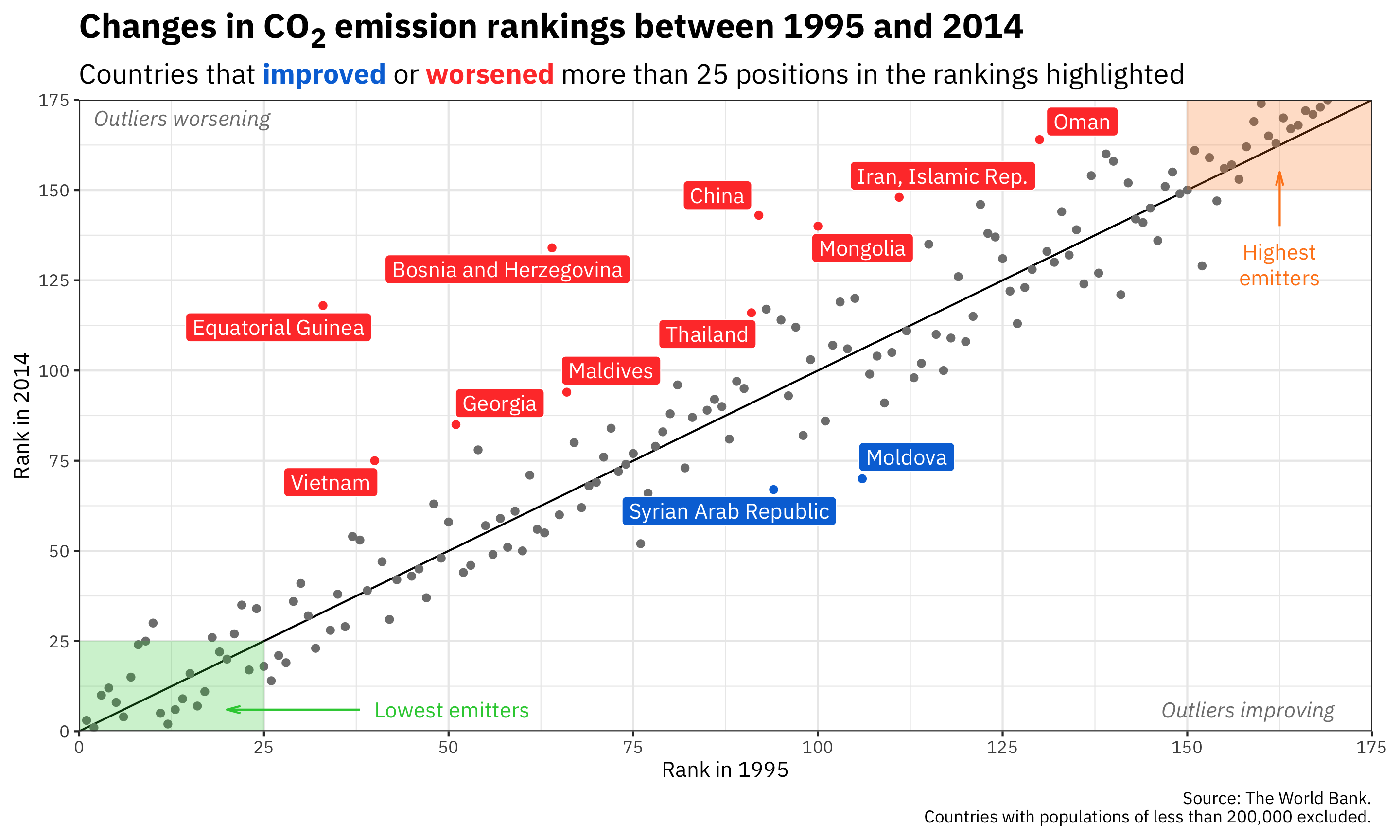
ggplot(co2_rankings,
aes(x = rank_1995, y = rank_2014)) +
# Add a reference line that goes from the bottom corner to the top corner
annotate(geom = "segment", x = 0, xend = 175, y = 0, yend = 175) +
# Add points and color them by the type of change in rankings
geom_point(aes(color = better_big_change)) +
# Add repelled labels. Only use data where big_change is TRUE. Fill them by
# the type of change (so they match the color in geom_point() above) and use
# white text
geom_label_repel(data = filter(co2_rankings, big_change == TRUE),
aes(label = country, fill = better_big_change),
color = "white") +
# Add notes about what the outliers mean in the bottom left and top right
# corners. These are italicized and light grey. The text in the bottom corner
# is justified to the right with hjust = 1, and the text in the top corner is
# justified to the left with hjust = 0
annotate(geom = "text", x = 170, y = 6, label = "Outliers improving",
fontface = "italic", hjust = 1, color = "grey50") +
annotate(geom = "text", x = 2, y = 170, label = "Outliers worsening",
fontface = "italic", hjust = 0, color = "grey50") +
# Add mostly transparent rectangles in the bottom right and top left corners
annotate(geom = "rect", xmin = 0, xmax = 25, ymin = 0, ymax = 25,
fill = "#2ECC40", alpha = 0.25) +
annotate(geom = "rect", xmin = 150, xmax = 175, ymin = 150, ymax = 175,
fill = "#FF851B", alpha = 0.25) +
# Add text to define what the rectangles abovee actually mean. The \n in
# "highest\nemitters" will put a line break in the label
annotate(geom = "text", x = 40, y = 6, label = "Lowest emitters",
hjust = 0, color = "#2ECC40") +
annotate(geom = "text", x = 162.5, y = 135, label = "Highest\nemitters",
hjust = 0.5, vjust = 1, lineheight = 1, color = "#FF851B") +
# Add arrows between the text and the rectangles. These use the segment geom,
# and the arrows are added with the arrow() function, which lets us define the
# angle of the arrowhead and the length of the arrowhead pieces. Here we use
# 0.5 lines, which is a unit of measurement that ggplot uses internally (think
# of how many lines of text fit in the plot). We could also use unit(1, "cm")
# or unit(0.25, "in") or anything else
annotate(geom = "segment", x = 38, xend = 20, y = 6, yend = 6, color = "#2ECC40",
arrow = arrow(angle = 15, length = unit(0.5, "lines"))) +
annotate(geom = "segment", x = 162.5, xend = 162.5, y = 140, yend = 155, color = "#FF851B",
arrow = arrow(angle = 15, length = unit(0.5, "lines"))) +
# Use three different colors for the points
scale_color_manual(values = c("grey50", "#0074D9", "#FF4136")) +
# Use two different colors for the filled labels. There are no grey labels, so
# we don't have to specify that color
scale_fill_manual(values = c("#0074D9", "#FF4136")) +
# Make the x and y axes expand all the way to the edges of the plot area and
# add breaks every 25 units from 0 to 175
scale_x_continuous(expand = c(0, 0), breaks = seq(0, 175, 25)) +
scale_y_continuous(expand = c(0, 0), breaks = seq(0, 175, 25)) +
# Add labels! There are a couple fancy things here.
# 1. In the title we wrap the 2 of CO2 in the HTML <sub></sub> tag so that the
# number gets subscripted. The only way this will actually get parsed as
# HTML is if we tell the plot.title to use element_markdown() in the
# theme() function, and element_markdown() comes from the ggtext package.
# 2. In the subtitle we bold the two words **improved** and **worsened** using
# Markdown asterisks. We also wrap these words with HTML span tags with
# inline CSS to specify the color of the text. Like the title, this will
# only be processed and parsed as HTML and Markdown if we tell the p
# lot.subtitle to use element_markdown() in the theme() function.
labs(x = "Rank in 1995", y = "Rank in 2014",
title = "Changes in CO<sub>2</sub> emission rankings between 1995 and 2014",
subtitle = "Countries that <span style='color: #0074D9'>**improved**</span> or <span style='color: #FF4136'>**worsened**</span> more than 25 positions in the rankings highlighted",
caption = "Source: The World Bank.\nCountries with populations of less than 200,000 excluded.") +
# Turn off the legends for color and fill, since the subtitle includes that
guides(color = FALSE, fill = FALSE) +
# Use theme_bw() with IBM Plex Sans
theme_bw(base_family = "IBM Plex Sans") +
# Tell the title and subtitle to be treated as Markdown/HTML, make the title
# 1.6x the size of the base font, and make the subtitle 1.3x the size of the
# base font. Also add a little larger margin on the right of the plot so that
# the 175 doesn't get cut off.
theme(plot.title = element_markdown(face = "bold", size = rel(1.6)),
plot.subtitle = element_markdown(size = rel(1.3)),
plot.margin = unit(c(0.5, 1, 0.5, 0.5), units = "lines"))