Graphic design
Task 1: Reflection
Write your reflection for the day’s readings.
Task 2: CRAP critique
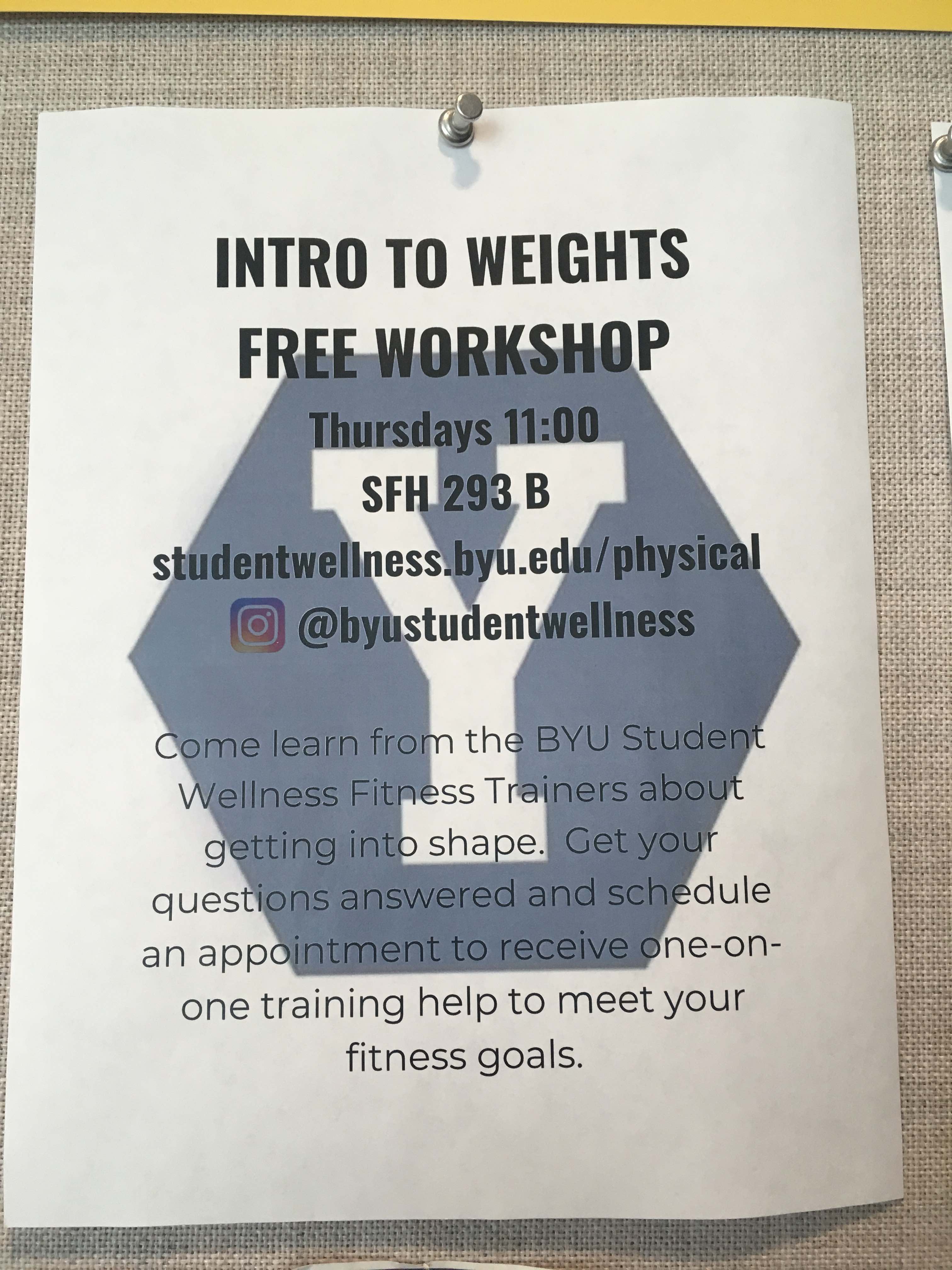
Critique the design of the poster for the BYU Student Wellness Center workshop below. Go through the CRAP checklist and analyze how well or poorly the poster follows each of the principles. Discuss how the poster’s adherence to (or non-adherence to) these principles influences its effectiveness.
(This would have been some random poster from GSU, but I haven’t been on campus since mid-March 😭)

Task 3: CRAP redesign
Redesign the poster for the BYU Student Wellness Center workshop. Use whatever program you want—even PowerPoint if you’re most comfortable with that, though it’ll probably be easier to use something like Canva or Adobe Illustrator. If you use Canva, don’t use any of the built-in templates—start from scratch with a blank page.
To save you from retyping everything, I’ve included all the text and Student Wellness hex logo in the zip file below:
I didn’t include the Instagram logo. If you want to use that, go find one online. You don’t have to use it. You don’t have to use the big paragraph of text either—you can rewrite it to shrink it down if you want.
Critique your new design using the CRAP checklist. How did you use contrast, repetition, alignment, and proximity in your improved design?
Turning everything in
You don’t need to worry about using R Markdown for this assignment (unless you really want to). On iCollege, submit a PDF of your new poster, along with a PDF of your reflection and your critiques of the original poster and your new poster.