Uncertainty
Getting started
For this exercise you’ll revisit Hans Rosling’s gapminder data on health and wealth.
You should use an RStudio Project to keep your files well organized (either on your computer or on RStudio.cloud). Either create a new project for this exercise only, or make a project for all your work in this class.
You don’t need to download any CSV files for this assignment. If you run library(gapminder) you’ll have access to a data frame named gapminder that contains all the data.
To help you, I’ve created a skeleton R Markdown file with a template for this exercise, along with some code to help you clean and summarize the data. Download that here and include it in your project:
In the end, the structure of your project directory should look something like this:
your-project-name\
  06-exercise.Rmd
  your-project-name.Rproj
To check that you put everything in the right places, you can download and unzip this file, which contains everything in the correct structure:
Task 1: Reflection
Write your reflection for the day’s readings.
Task 2: Visualizing uncertainty with gapminder
Make the following plots and briefly explain what they show:
Make a histogram of logged GDP per capita for 1997 only, across all five continents
Make a ridge plot of global life expectancy over time, from 1952 to 2007. You’ll need to use the full gapminder data, not the 1997-only data. Each ridge should show the distribution of the world’s life expectancy for each given year (similar to the temperature ridge plot in the example).
Important note:
yearwill be on the y-axis, but it must be a categorical variable to work with ggridges, so you’ll either need to wrap it inas.factor()likeaes(..., y = as.factor(year)), or add a new categorical/factor year column to the gapminder dataset withmutate().Make a filtered dataset that selects data from only 2007 and removes Oceania. Show the distribution of logged GDP per capita across the four continents using some combination of boxplots and/or violin plots and/or strip plots, either overlaid on top of each other, or using their
geom_half_*()counterparts from gghalves.
The example for today’s session will be incredibly helpful for this exercise. Reference it.
You don’t need to make these super fancy, but if you’re feeling brave, experiment with adding a labs() layer or changing colors or modifying themes and theme elements.
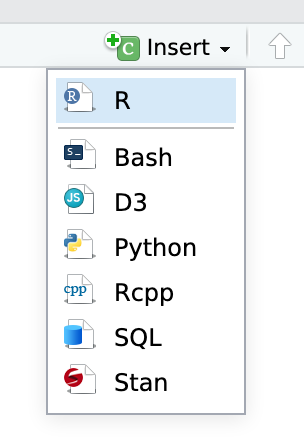
You’ll need to insert your own code chunks where needed. Rather than typing them by hand (that’s tedious and you might miscount the number of backticks!), use the “Insert” button at the top of the editing window, or type ctrl + alt + i on Windows, or ⌘ + ⌥ + i on macOS.
Turning everything in
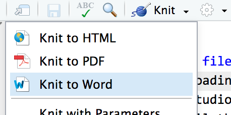
When you’re all done, click on the “Knit” button at the top of the editing window and create an HTML or Word version (or PDF if you’ve installed tinytex) of your document. Upload that file to iCollege.