Relationships
Getting started
For this exercise you’ll use precinct-level data from the 2016 presidential election to visualize relationships between variables. This data comes from the MIT Election Data and Science Lab.
You should use an RStudio Project to keep your files well organized (either on your computer or on RStudio.cloud). Either create a new project for this exercise only, or make a project for all your work in this class.
To help you, I’ve created a skeleton R Markdown file with a template for this exercise, along with some code to help you clean and summarize the data. Download that here and include it in your project:
In the end, the structure of your project directory should look something like this:
your-project-name\
  07-exercise.Rmd
  your-project-name.Rproj
  data\
    results_2016.csv
To check that you put everything in the right places, you can download and unzip this file, which contains everything in the correct structure:
The example for today’s session will be incredibly helpful for this exercise. Reference it.
Again, you don’t need to make your plots super fancy, but if you’re feeling brave, experiment with adding a labs() layer or changing colors or modifying themes and theme elements.
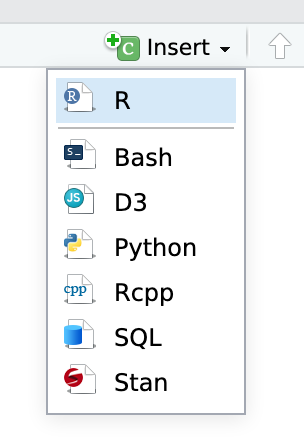
You’ll need to insert your own code chunks where needed. Rather than typing them by hand (that’s tedious and you might miscount the number of backticks!), use the “Insert” button at the top of the editing window, or type ctrl + alt + i on Windows, or ⌘ + ⌥ + i on macOS.
Task 1: Reflection
Write your reflection for the day’s readings.
Task 2: Combining plots
Make 2–3 plots of anything you want from the results_2016 data (histogram, density, boxplot, scatterplot, whatever) and combine them with patchwork. Look at the documentation to see fancy ways of combining them, like having two rows inside a column.
Task 3: Visualizing regression
Coefficient plot
Use the results_2016 data to create a model that predicts the percent of Democratic votes in a precinct based on age, race, income, rent, and state (hint: the formula will look like this: percent_dem ~ median_age + percent_white + per_capita_income + median_rent + state)
Use tidy() in the broom package and geom_pointrange() to create a coefficient plot for the model estimates. You’ll have 50 rows for all the states, and that’s excessive for a plot like this, so you’ll want to filter out the state rows. You can do that by adding this:
tidy(...) %>%
  filter(!str_detect(term, "state"))
The str_detect() function looks for the characters “state” in the term column. The ! negates it. This is thus saying “only keep rows where the word ‘state’ is not in the term name”.
You should also get rid of the intercept (filter(term != "(Intercept)")).
Marginal effects
Create a new data frame with tibble() that contains a column for the average value for each variable in your model except for one, which you vary. For state, you’ll need to choose a single state. The new dataset should look something like this (though this is incomplete! You’ll need to include all the variables in your model, and you’ll need to vary one using seq()) (like seq(9000, 60000, by = 100) for per_capita_income). The na.rm argument in mean() here makes it so missing values are removed—without it, R can’t calculate the mean and will return NA instead.
data_to_predict <- tibble(median_age = mean(results_2016$median_age, na.rm = TRUE),
                          percent_white = mean(results_2016$percent_white,  na.rm = TRUE),
                          state = "Georgia")  # Or whatever
Use augment() to generate predictions from this dataset using the model you created before. Plot your varied variable on the x-axis, the fitted values (.fitted) on the y-axis, show the relationship with a line, and add a ribbon to show the 95% confidence interval.
Bonus task! Correlograms
This is entirely optional but might be fun.
For extra fun times, if you feel like it, create a correlogram heatmap, either with geom_tile() or with points sized by the correlation. Use any variables you want from results_2016.
Turning everything in
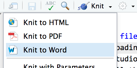
When you’re all done, click on the “Knit” button at the top of the editing window and create an HTML or Word version (or PDF if you’ve installed tinytex) of your document. Upload that file to iCollege.